Every creative journey leaves behind ideas that never reach the world. Not because they lacked strength, but because timing, direction, or decisions moved elsewhere. The Archive is a place for those ideas, work that stayed on the shelf but remains close to the designer who created it.
Oasis – The Good Water
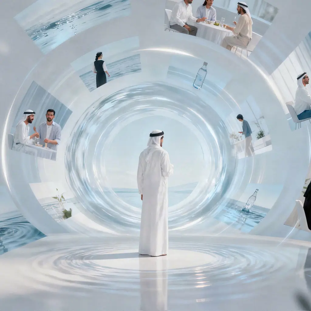
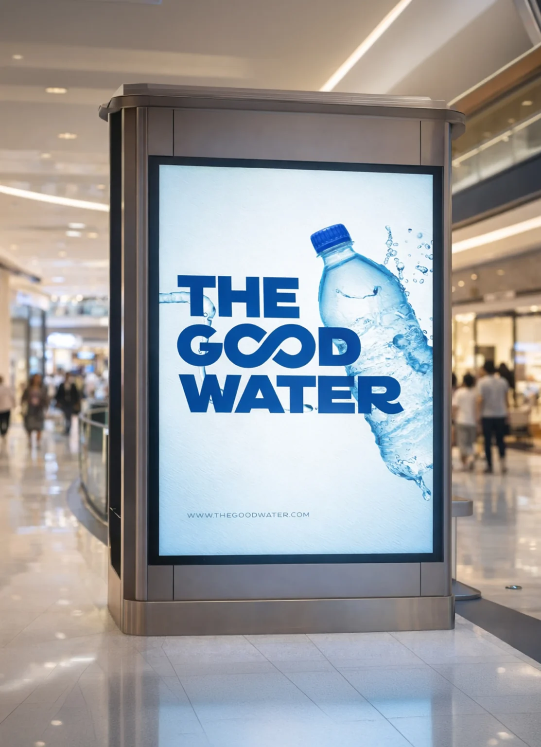
An unselected brand direction developed for Oasis as part of a larger repositioning proposal for National Food Products Company. Built around the idea “The Good Water,” the concept explored how a bottled water brand could move beyond product features and become a broader expression of lifestyle, positivity, and everyday relevance. Though never brought to market, it remains one of those ideas that stayed close, conceptually clear, visually strong, and still meaningful years later.
Client
Sector
Year
Role
Brief
A repositioning idea for a more ownable water brand.
The project began as part of a wider strategic proposal to re-evaluate Oasis and strengthen its position within a highly competitive bottled water market. The challenge was clear: when product quality is largely perceived as similar across brands, distinction has to come from positioning, expression, and the world a brand creates around itself.
Rather than focusing only on functional claims, this direction looked at how Oasis could become more memorable, emotionally relevant, and visually structured across product, lifestyle, and communication touchpoints.
Approach
Building a brand world around goodness and continuity.
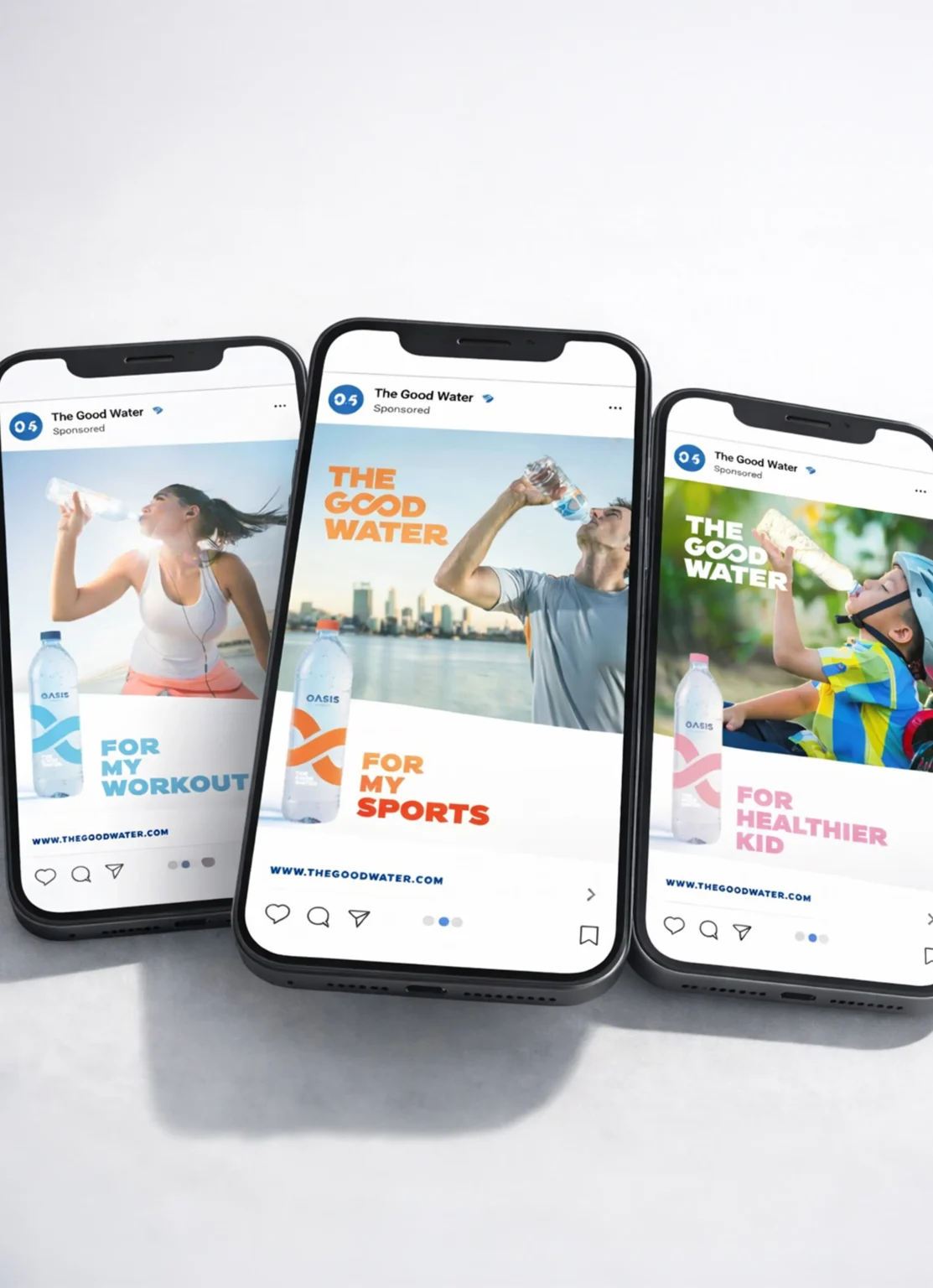
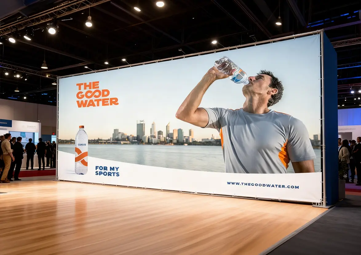
The concept was shaped around the line “The Good Water,” turning a simple product into a broader brand idea that could expand naturally into packaging, campaigns, and lifestyle narratives such as The Good Life, The Good Times, The Good Ramadan, and more. The visual language introduced an infinity-inspired form that worked both as a distinctive brand gesture and as a flexible system across bottles and communication.
The direction also proposed a clearer brand architecture for sub-ranges including Original, Sport, Junior, and Exclusive, supported by colour differentiation and a cleaner, more unified expression. Packaging concepts extended this system into a fresh, modern identity that felt minimal yet scalable.
Outcome
A complete direction that never reached the shelf.
Although the concept was not taken forward, it developed into a fully imagined brand route with strategic positioning, identity thinking, packaging applications, campaign language, and expandable communication scenarios. That completeness is part of what makes it worth archiving rather than forgetting.
Deliverables included brand idea development, packaging concepts, sub-brand structure, campaign visuals, teaser and reveal directions, and lifestyle-led communication territories, all built to show how the brand could evolve with clarity and consistency.
My Role
Developing the idea before it became real.
I led the creative direction behind this route, shaping the concept, visual language, and strategic expression of the proposed rebrand. My role included translating research and positioning thinking into an ownable idea, then extending that idea across packaging, campaign narratives, and brand architecture.
For me, this project represents the kind of work that often lives in the archive but never loses its value, a reminder that some of the most honest creative ideas are not always the ones that get produced, but the ones that remain worth revisiting.
Event Branding
Abu Dhabi Gahwa Championship
Sector
Culture & Events
Overview
Developed a cultural branding direction celebrating heritage while presenting the championship in a contemporary visual language.
Year
2022
Proposed concept, not executed.
Design System
Al Jazira Football Club – Sports Kit
Sector
Sports
Overview
Designed a complete kit system including training, home, and international variants, blending performance with strong brand identity.
Year
2023
Proposed concept, not executed.
Campaign
Al Fardan Exchange
Sector
Finance
Overview
Created a campaign platform focusing on trust, speed, and emotional connection in financial transactions.
Year
2022
Proposed concept, not executed.
Launch Campaign
Al Tayer Properties
Sector
Real Estate
Overview
Conceptualized a launch campaign positioning the development as a lifestyle-driven destination rather than just real estate.
Year
2023
Proposed concept, not executed.
Awareness Campaign
Emirates Post
Sector
Logistics
Overview
Developed a campaign using the “boomerang” concept to communicate how incomplete shipment details lead to returns, simplifying a complex backend process.
Year
2022
Proposed concept, not executed.
360 Campaign
Department of Energy, Abu Dhabi
Sector
Government
Overview
Proposed a strategic communication platform built on “Speak, Look, Behave” to align messaging, visuals, and emotional impact across all touchpoints.
Year
2024
Proposed concept, not executed.
Digital & Social
Abu Dhabi Equestrian Club
Sector
Sports & Culture
Overview
Designed a yearly content and digital strategy to elevate the club’s presence and connect tradition with a modern audience.
Year
2023
Proposed concept, not executed.
60 Campaign
Sporter
Sector
Fitness & E-commerce
Overview
Built a powerful activation concept positioning health as a journey and Sporter as the ultimate destination for that journey.
Year
2019
Proposed concept, not executed.
Branding
Emirates Nuclear Energy Corporation (ENEC)
Sector
Energy
Overview
Created a strategic brand refresh framework focusing on positioning, communication, and a unified brand expression system.
Year
2022
Proposed concept, not executed.
360 Campaign
Bayut
Sector
Real Estate
Overview
Developed a 360 communication platform focused on redefining property search as an emotional journey, not just a transaction.
Year
2022
Proposed concept, not executed.